Custom Admin UI Logo
In this guide we'll show you how to add a custom logo to the Keystone Admin UI.
Presently the only replaceable component in the Admin UI is the logo. If you have suggestions as to other components you would like to be able to customise, let us know on Slack
To import a custom component for rendering within the Admin UI, ensure that the admin/config.tsx file exists in the root of your Keystone project. This file expects a named export components.
// admin/config.tsxfunction CustomLogo () {return <h3>Custom Logo here</h3>}export const components = {Logo: CustomLogo}
If you have styling constraints, we recommend using the jsx export from the @keystone-ui/core package, as this will ensure that the version of emotion you're using conforms with the version of emotion used internally within Keystone.
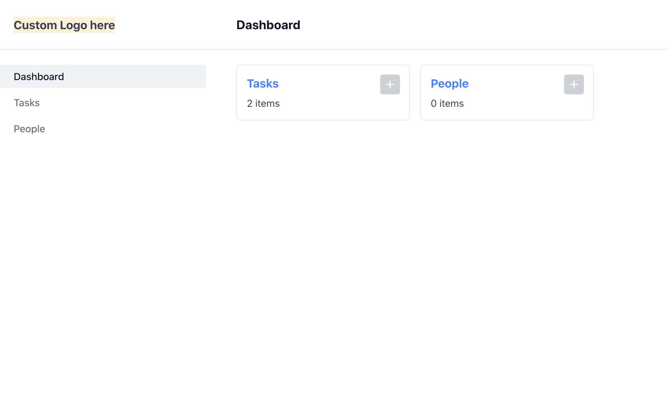
// admin/config.tsx/** @jsxRuntime classic *//** @jsx jsx */import { jsx } from '@keystone-ui/core';function CustomLogo () {return <h3 css={{background: 'papayawhip'}}>Custom Logo here</h3>}export const components = {Logo: CustomLogo}
Of course this is purely a recommendation, if you would prefer to roll your own css-in-js solution in with your custom component please feel free to! Although this may require additional configuration outside of the scope of this guide.
Once you've added your custom logo component you should see it rendered out in the Admin UI. 
Related resources
Example: Custom Admin UI Logo →
Adds a custom logo component in the Admin UI. Builds on the Task Manager starter project.
Custom Admin UI Navigation Guide →
Learn how to create your own custom Navigation components in Keytone’s Admin UI.
Custom Admin UI Pages Guide →
Learn how to add your own custom pages to Keystone’s Admin UI.